The New La Liga Logo – The Truth About The Change
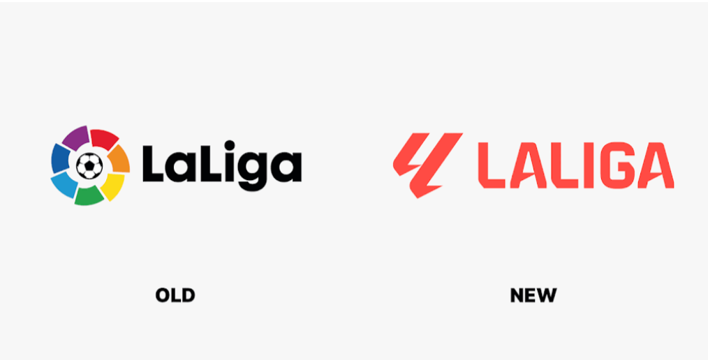
La Liga, the top professional football league in Spain recently unveiled a new logo. The new La Liga logo was designed by the Grávita studio. The logo features a futuristic, angular “LL” monogram, representing the initials of La Liga. It is a departure from the previous logo, which had a soccer ball inside a color wheel.
The new logo also introduces a coral-red color scheme. The design has received mixed reactions from fans, with some finding it angular and others appreciating its modernity.
The new logo has been met with mixed reactions from fans and pundits. Some people have praised the new logo for its simplicity and modernity, while others have criticized it for being too plain and boring.
La Liga has said that the new logo is part of a wider rebrand that is intended to make the league more modern and attractive to new fans and sponsors. The league is hoping that the new logo will help to boost its global brand and attract new revenue streams.
Contents
- 1 Reaction To The New La Liga Logo
- 2 Impact Of The New Logo On La Liga’s Brand
- 3 Outlook For The Future Of La Liga’s Logo
- 4 People Also Ask
- 5 Did La Liga Change Their Logo?
- 6 Why Is Laliga Changing Their Logo?
- 7 What Was The Reason For Laliga’s Decision To Change Their Logo
- 8 What Is The New Symbol Of La Liga?
Reaction To The New La Liga Logo
The reaction to the new La Liga logo has been mixed. Some fans have praised the new logo for its simplicity and modernity, while others have criticized it for being too plain and boring.
One fan on Twitter said, “I love the new La Liga logo. It’s simple, but it’s also very effective. It really captures the essence of the league.”
Another fan said, “I’m not a fan of the new La Liga logo. It’s too plain and boring. I much prefer the old logo.”
Impact Of The New Logo On La Liga’s Brand
It remains to be seen how the new logo will impact La Liga’s brand. However, the league is hoping that the new logo will help to attract new fans and sponsors.
La Liga CEO Javier Tebas expressed that the new logo represents their commitment to modernity and innovation. He believes that the new logo will attract new fans and sponsors, as well as contribute to the growth of their global brand.
Javier Tebas has been the President of La Liga since April 2013 and has focused on areas such as economic oversight, the centralized sale of audiovisual rights, and the internationalization strategy. He has implemented strict financial rules for La Liga clubs to ensure long-term success. Javier Tebas is a Spanish lawyer and has worked for several La Liga clubs throughout his career.
In summary, Javier Tebas, the CEO of La Liga, stated that the new logo represents their commitment to modernity and innovation. He believes that it will help attract new fans and sponsors and contribute to the growth of their global brand. Javier Tebas has been the President of La Liga since 2013 and has focused on various areas to ensure the success of Spanish football.
Outlook For The Future Of La Liga’s Logo
It is too early to say what the long-term impact of the new La Liga logo will be. However, the league is hoping that the new logo will help to boost its global brand and attract new revenue streams.
Only time will tell whether the new logo will be a success. However, La Liga is confident that the new logo is a step in the right direction.
People Also Ask
Did La Liga Change Their Logo?
Yes, La Liga changed their logo. The new logo was officially unveiled in June 2023 and replaces the colored circle that has been the identity of the Spanish league for 30 years.
The new logo is represented as LL, which stands for La Liga, and is designed to personify the world’s largest football ecosystem. The new corporate color is coral, which symbolizes the pride, passion, energy, and excitement of football.
The changes are part of a rebranding campaign that reflects La Liga’s growth and evolution over the last decade. The new logo is expected to attract new fans and sponsors and contribute to the growth of La Liga’s global brand.
Why Is Laliga Changing Their Logo?
La Liga is changing their logo to represent their commitment to modernity and innovation. The new logo is represented as LL, which stands for La Liga, and is designed to personify the world’s largest football ecosystem.
The new corporate color is coral, which symbolizes the pride, passion, energy, and excitement of football. The rebranding campaign is a reflection of La Liga’s growth and evolution over the last decade.
The league has also changed its name to La Liga EA, reflecting its new main sponsor. The new logo will also come with the tagline, “The Power of Our Futbol,” representing the unifying purpose of the league as well as the power of its clubs and their fans. The changes are expected to attract new fans and sponsors and contribute to the growth of La Liga’s global brand.
What Was The Reason For Laliga’s Decision To Change Their Logo
La Liga changed their logo as part of a rebranding campaign that reflects the league’s growth and evolution over the last decade. The new logo is represented as LL, which stands for La Liga, and is designed to personify the world’s largest football ecosystem.
The new corporate color is coral, which symbolizes the pride, passion, energy, and excitement of football. The changes are expected to attract new fans and sponsors and contribute to the growth of La Liga’s global brand.
The league has also changed its name to La Liga EA, reflecting its new main sponsor. The new logo will also come with the tagline, “The Power of Our Futbol,” representing the unifying purpose of the league as well as the power of its clubs and their fans.
What Is The New Symbol Of La Liga?
The new symbol of La Liga is represented as LL, which stands for La Liga. It is designed to personify the world’s largest football ecosystem. The design is simplified, with a monochrome look featuring pale red as the main color.
The logo consists of a double ‘L’ design, referencing La Liga. This change in the logo is part of LaLiga’s rebranding campaign and reflects the league’s growth and evolution over the years. The new symbol aims to represent the pride, passion, energy, and excitement of football. Overall, the new symbol of La Liga is a modern and simplified representation of the league’s identity.

